
Personally Procured Moves
Designing the framework for a new type of move.
Overview
Over 400,000 military personnel and their families move each year. Research has shown that after active duty, this is the most difficult thing about military service. My team was tasked with creating a streamlined system for military personnel to request and manage their moves. For launch, we wanted to include several types of moves: movers showing up and doing the work for you, arranging for items to be placed into and taken out of storage during the course of a move, and for service members to move their own things (also known as a personally procured move or PPM). Additionally, a partner application needed to be created in tandem to help military office personnel plan, request, review, schedule, and track the movement of service members’ personal property.
My role
I designed these two complementary experiences for the third type of move (PPM) from inception to proof of concept for mobile and desktop web: one for service members to plan their move and one for military office staff to support and execute the move.
Solution
To prepare for launch, we ensured that the service member web app was responsive and would accommodate all the necessary information input and document uploads folks would need to get their maximum allowable reimbursement. We also ensured the office app displayed all the data required to approve a move and determine the correct reimbursement amount. These two applications worked together throughout the entire lifecycle of a move.
Exploration & Research
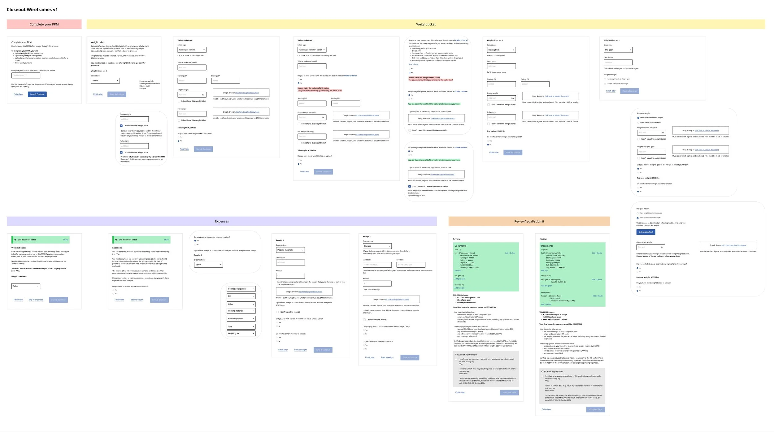
After some initial discovery work with my product team, we realized that PPMs were by far the most complicated move type that we had yet to tackle on the project. As compared to other move types, PPMs required customers to interact with them multiple times throughout their lifecycle so we decided to break up the work into two parts: booking a PPM and closing out a PPM.

Booking
We quickly learned that a version of booking a PPM had previously been built, so I revisited this discovery work and leveraged existing UI patterns as our foundation to reduce design and engineering rework. Auditing the existing flow showed me places where I could refine the information architecture and copy to make the experience event clearer for users.

Closeout
After refining the booking process, I moved onto the closeout process. This was a entirely new feature set and flow for the project. My first step with any new work is to plan out research with users. However, our client was new to the iterative design process as well as agile product development and were not open to the idea of user research. So I focused on diving deep into learning and understanding their requirements as a form of building trust.
While the overall flow was simple: service members come back to report how much they spent, office users approve or reject that information, and service members either make changes or download their final payment packet, the details and nuances of implementing that into a product took many forms:
how to organize the flow to gather a lot of data and documents in one session,
what was the relationship between data and documents (one to one, or one to many),
how would this be presented to office users,
how do office users needs inform how we collect data from service members,
what was the back and forth of reviewing and editing documents, and
how might we reduce that scope for launch
I led us through several iterations of wireframing out the UI, reducing complexity with each step.
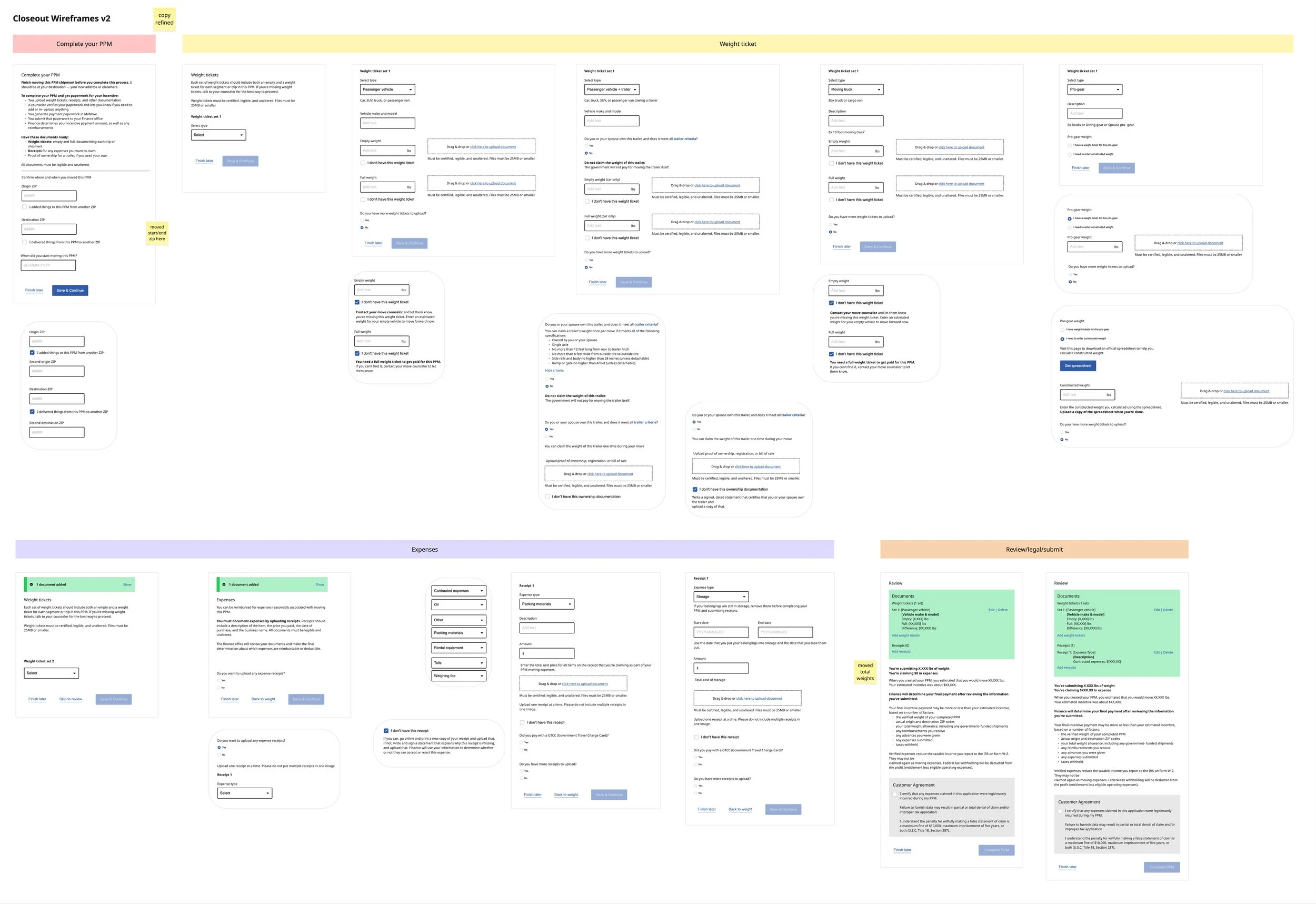
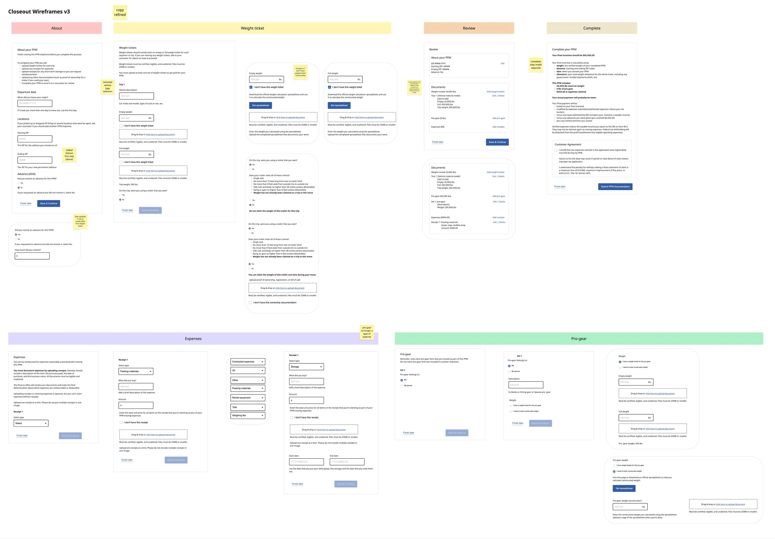
After honing in on the details of the overall flow I used existing patterns and our design system to build out the UI to help speed up engineering and lower cognitive load for users who were already familiar with many of these elements.

Eventually, we developed enough trust with our client by working side by side with them and showing by doing that they granted us access to some users to do usability testing of the closeout process. Thankfully we’d done a lot of heavy lifting at the beginning of the work to tease out user needs from our client along with secondary research that usability testing verified that for us. But it also helped us identify some the copy that needed to be refined in order to make the flow even clearer for users.

Outcome
When traditional means of user research are not available you need to get crafty.
It’s critical to work shoulder to shoulder and build trust with a client. Regularly showing how a thing is done in public goes a very long way.
Just because someone built it before, doesn’t necessarily mean reusing it will make things easier: fortunately, that was the case for design but for engineering it made things much more difficult and the timeline longer than anticipated.
In retrospect, this work should have been broken down into even more granular parts. Closeout was too big on its own.
Government work can be tricky, before I could see the launch of the app, the contract was awarded to a different firm so we had to pass on our work.